e-Commerce Product Photography: The Importance of a Pure White Background
e-Commerce Product Photography: The Importance of a Pure White Background
When preparing product photos for e-commerce, one of the most important elements to consider is the background—specifically, the use of a clean, pure white backdrop.
Why Background Color Matters
Product photos are the visual representation of what’s being sold. These images must do more than simply display the product; they need to attract attention, build trust, and help convert viewers into buyers. But they must also accurately depict the product itself. That means showing all relevant angles or components (especially if it's a set), rendering colors correctly, and providing a true sense of size and proportion.
Different e-commerce platforms have their own requirements for product images, but many—Amazon in particular—enforce strict image guidelines. Chief among these is the requirement that the primary product photo has a pure white background.
So what does "pure white" mean?
On an RGB scale (used to define colors for digital images), pure white is defined as RGB 255, 255, 255—the maximum value for red, green, and blue, combined to create the brightest possible white. This is not to be confused with cream, off-white, or light gray, which may appear white to the eye but will not meet platform standards.
Beyond aesthetics and consistency, these rules exist to ensure customers get a clear, undistracted view of the product. A cluttered or tinted background can draw attention away from the item—or even mislead the viewer about its color or detail.
Achieving Pure White in Photography
As a professional product photographer, I take several steps to achieve a true white background and accurate color reproduction:
- Start with the Right Background Material
I use clean, white backgrounds that photograph well under proper lighting. Not all white materials reflect the same way under light, so the base choice matters.
- Control the Lighting
Lighting plays a major role in the final image. I may use ambient light, but more often rely on strobes or continuous lights—tools that allow better control over intensity and color temperature. Even light that appears white can skew image tones if it leans warm (yellow) or cool (blue).
- Color Accuracy in Post-Processing
After capturing the image, I analyze it in editing software to fine-tune the background and ensure it reads as RGB 255, 255, 255—especially for platforms that require strict compliance. This process also helps ensure the product itself looks accurate in terms of color and exposure.
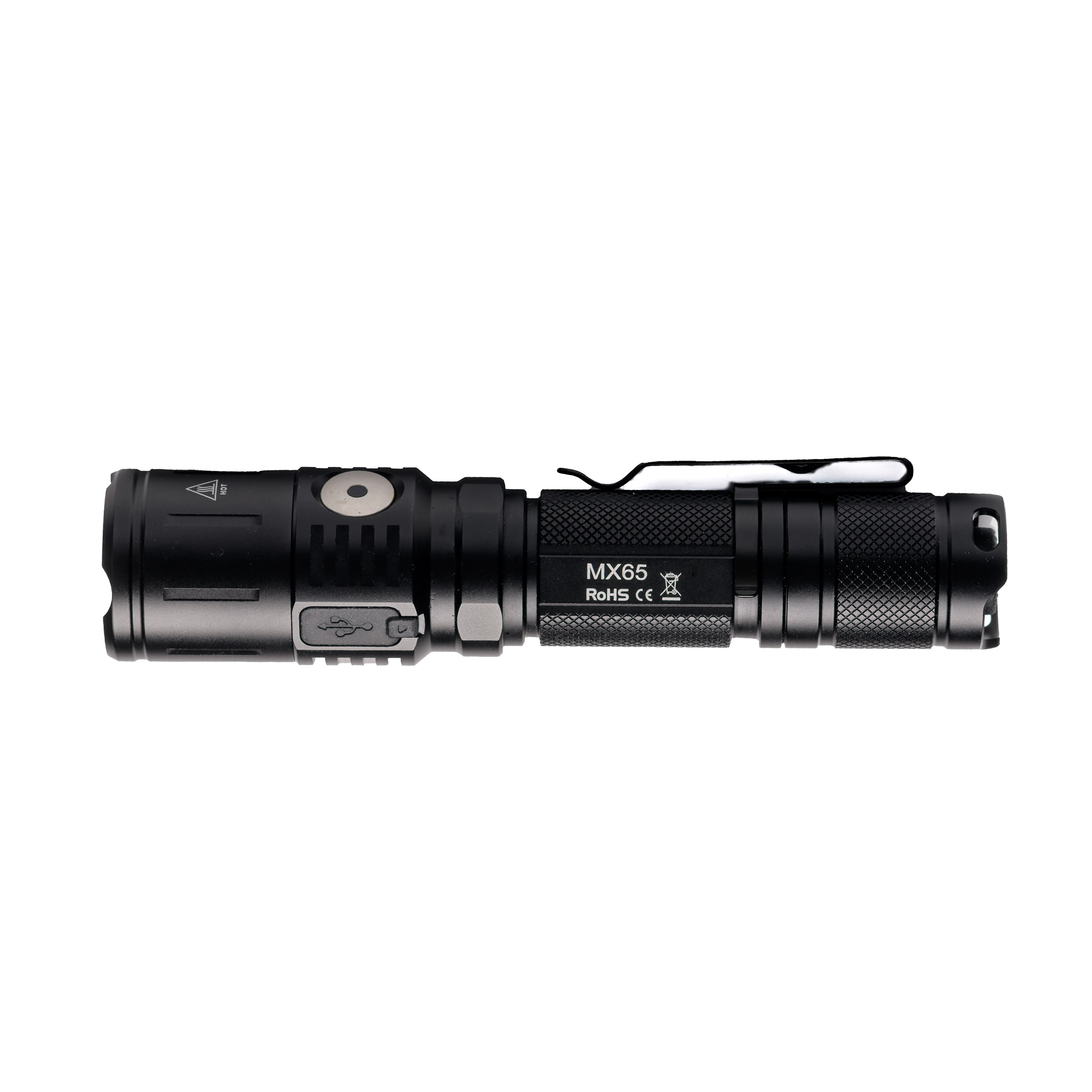
A Closer Look: Sample Background Comparisons
Below are three example images that demonstrate how subtle the difference can be—yet how critical it is when working with e-commerce platforms:
- Tactical light on a pure white background (255,255,255)
- Red nail polish on a pure white background (255,255,255)
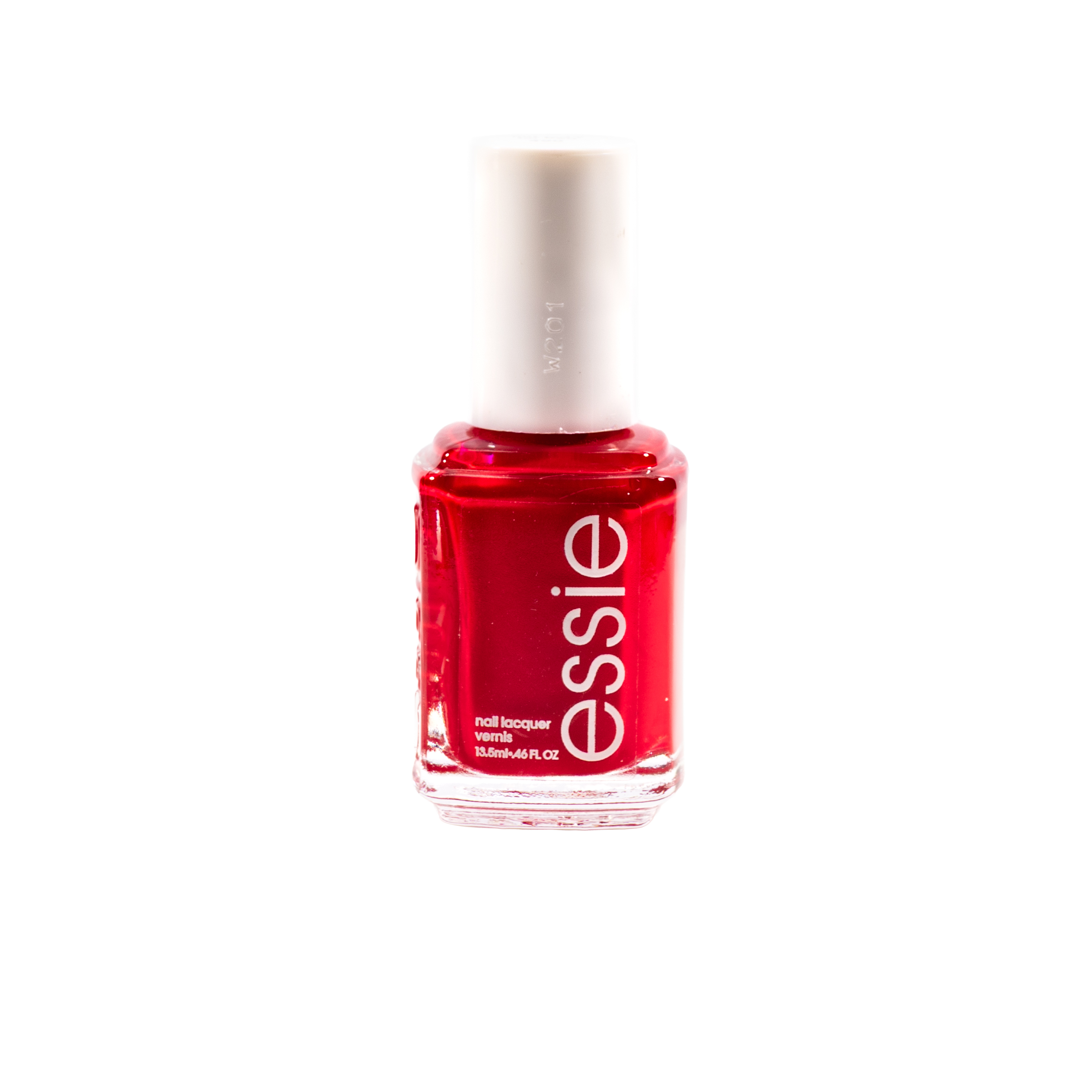
- Red nail polish on an off-white background (240,240,240)

To the untrained eye, all three may look very similar. But only the first two meet strict platform standards. Slight variations—like the 240,240,240 background in the last example—may result in image rejection or reduced visual impact.
For more information, email me at
Article written by R.C. Mathews with AI assistance
All images produced and copyrighted by Rick C. Mathews, rcm Imaging